Untangling the confusion in connected accounts
Klarna is a publicly listed company, so specific figures and unreleased screens can't be shared here. The screens shown are from the live product, with personal details blurred. I'm happy to walk through the work in more detail in conversation, within what I'm able to share.
I was responsible for...
- Leading design for Sign in with Klarna, linked accounts and connected accounts
- Learning the technical side well enough to explain it simply
- Benchmarking account linking in products people already use
- Deciding where sign-in appears in the shopping and payment journey
- Following the metrics and adjusting the design as the numbers moved
Sign in with Klarna, linked accounts and connected accounts all let people use their Klarna account with a merchant, and people struggled to tell them apart. I led the design work to make each one clear, giving people enough information to decide without adding friction at the moments that matter most: during checkout and while exploring a new merchant.
• • •
Project objectives...
Help people understand what they are agreeing to when they use their Klarna account with a merchant, and keep that explanation light enough that it never gets in the way of a purchase or a first visit to a new store.
• • •
Klarna is a publicly listed company, so specific figures and unreleased screens can't be shared here. The screens shown are from the live product, with personal details blurred. I'm happy to walk through the work in more detail in conversation, within what I'm able to share.
I was responsible for...
- Leading design for Sign in with Klarna, linked accounts and connected accounts
- Learning the technical side well enough to explain it simply
- Benchmarking account linking in products people already use
- Deciding where sign-in appears in the shopping and payment journey
- Following the metrics and adjusting the design as the numbers moved
• • •
Project Details...
Three things that sound like one
Signing in to a store with your Klarna account, keeping that store linked so you stay signed in, and managing which apps and websites are connected to your account are three different things. To the people using them they sounded like one, and the difference matters: each shares different information and lasts for a different length of time. My job was to untangle them, so that people knew what they were saying yes to.
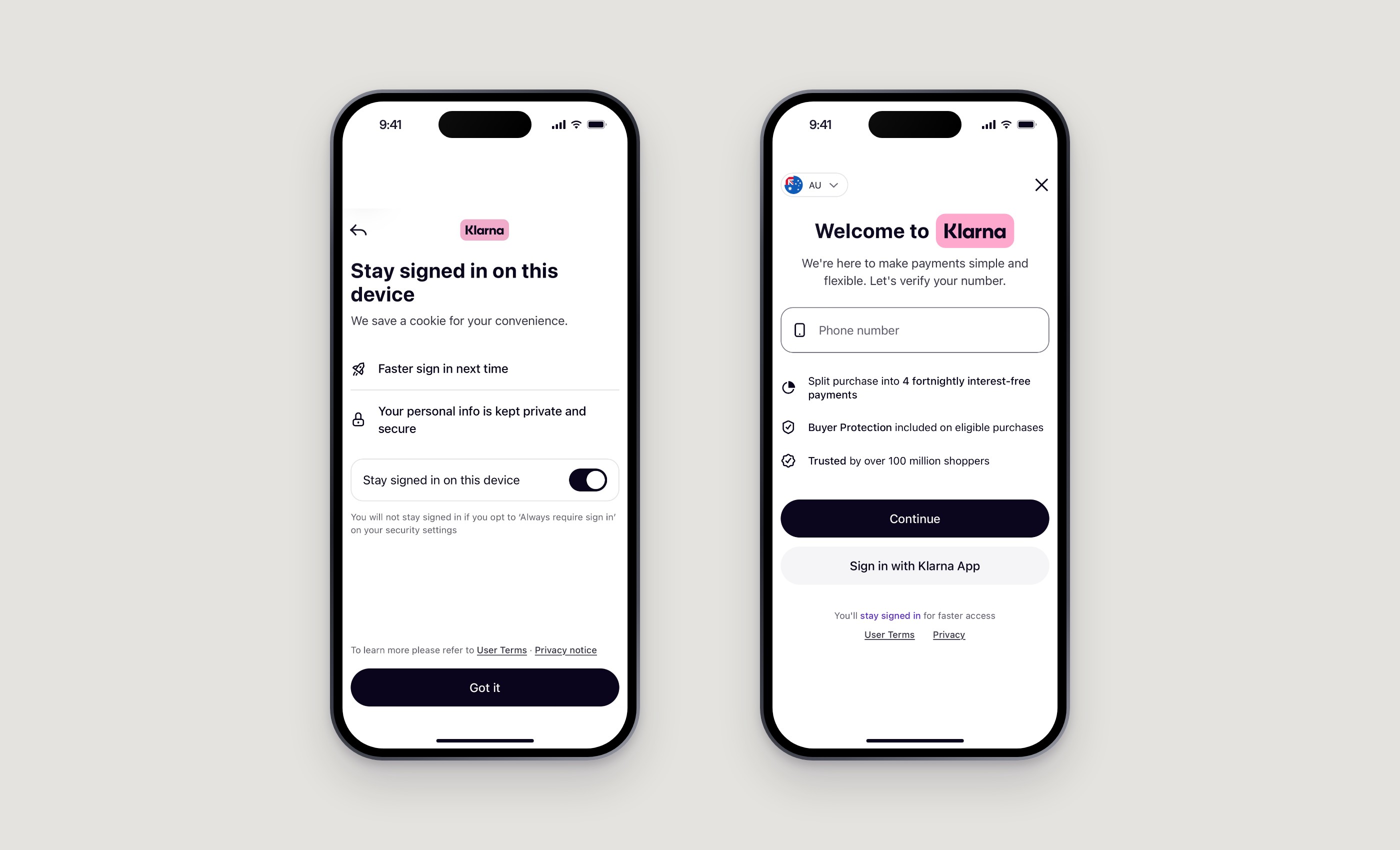
Understanding the technology first
As the lead designer I needed to understand the technical side properly: what is shared, when, for how long, and what happens when someone changes their mind. It was even more important to turn that into the simplest possible explanation for the person in front of the screen. If I could not explain it in a sentence, the design was not ready.

Borrowing from what people already know
The clearest way to explain something new is through a mechanism people already use. I researched account linking in everyday products: Bandsintown using Spotify to log in, Sign in with Google as the most familiar example of all, and eBay using PayPal to sign in. The eBay case was a lesson in what not to do, since they discontinued it. Seeing where these patterns earned trust, and where they confused people, shaped the words and the structure I chose.

High stakes moments
The hardest part was timing. Sign-in can appear during payment, or much earlier while someone is exploring a merchant for the first time. Both are high stakes. At checkout, any extra step risks the purchase. With a new merchant, people are still deciding whether to trust the store at all. Surfacing sign-in in the payment journey, and earlier in the shopping journey, led to many interesting and complicated discussions about how much to say, and when.
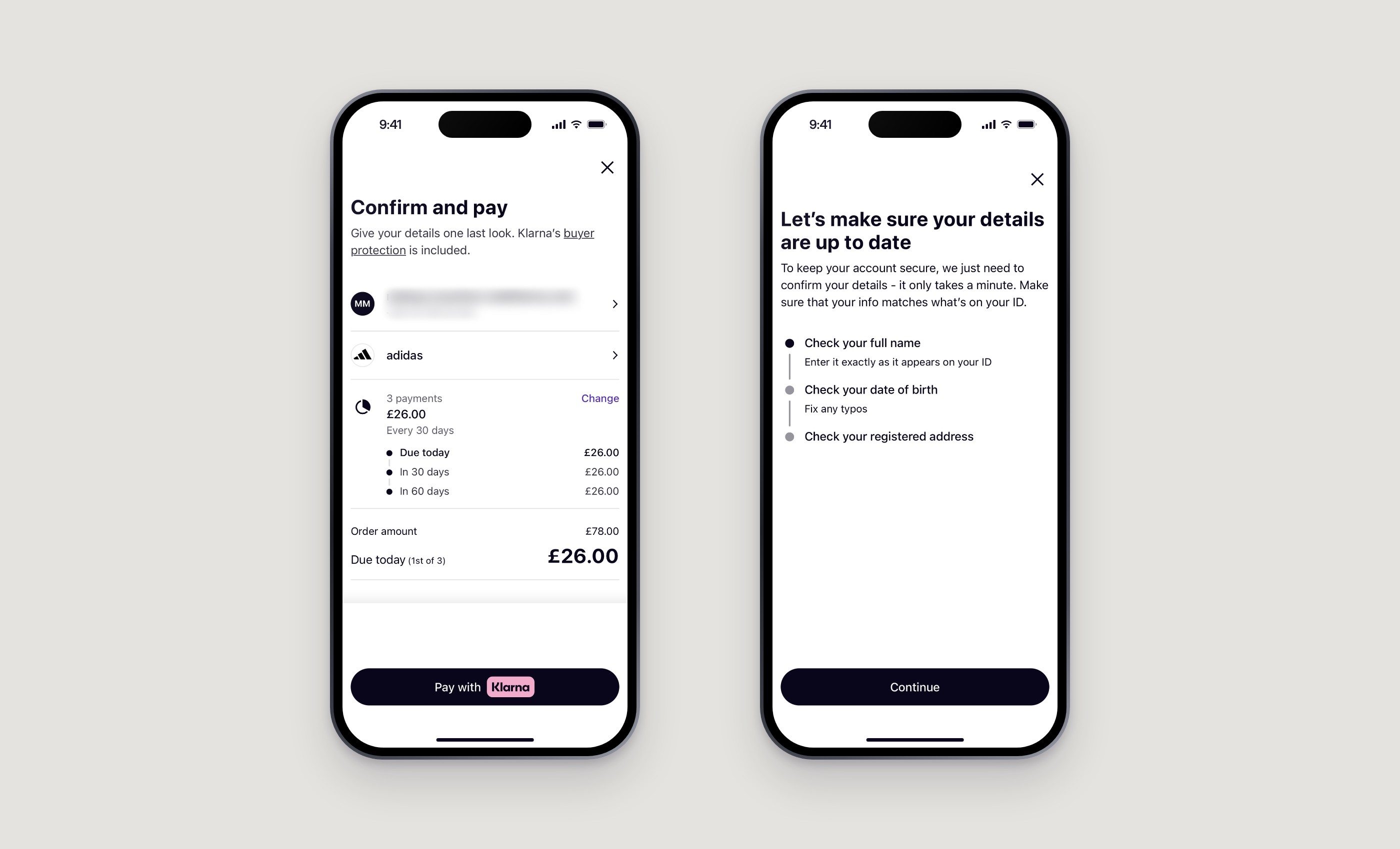
The goal was enough information to make a real choice, and nothing that slows a person down when they are about to pay.
Small changes, large effects
I followed the metrics closely. Small changes to wording, order and placement had major effects on the end numbers, so every decision was a balance of intuition, shared company learnings and an obsession with the data.
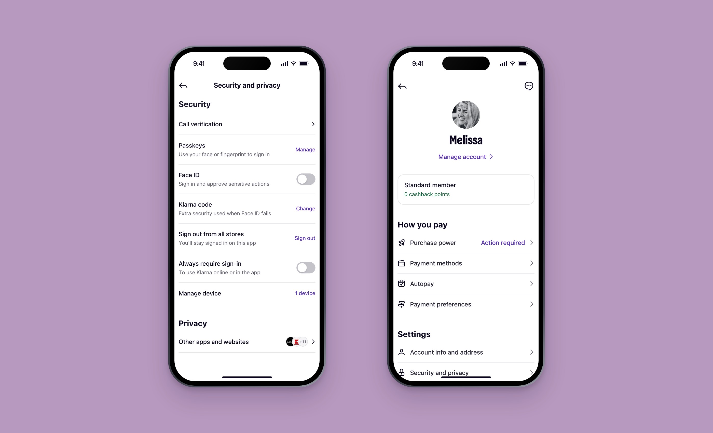
What I learned
- Understand the technology fully, then hide almost all of it.
- Explain new things through mechanisms people already trust.
- Treat a discontinued pattern as research too.
- Where sign-in appears matters as much as what it says.
- Let the data check your intuition, and let shared learnings check both.
• • •
Applications Used
Applications Used
Figma for design concepts and prototyping